Answer first
Beautiful AI-generated frontends do not come from a magic prompt. They come from a workflow that gives the agent taste, constraints, examples, anti-examples, and a way to inspect its own output.
The Real Problem: AI Can Build a Page, But Not Always a Product Surface
AI coding agents are getting much better at frontend work.
That is not hype. Recent models can produce interface layouts that would have looked impossible from an LLM a year ago. Google's Gemini 3.5 Flash model card describes evaluations across coding, agentic tool use, and UI control. Anthropic positions Claude Opus around advanced coding, reasoning, and agentic work.
So yes, model capability matters.
But the biggest gap is not whether the model can render a nice card.
The gap is whether it understands what a beautiful frontend is supposed to do.
A beautiful frontend is not decoration. It is a product surface where hierarchy, spacing, copy, motion, data, states, and interaction all make the user's next action feel obvious.
That is why many AI-generated frontends still feel wrong even when they look polished in a screenshot.
They often have:
- generic hero sections
- vague marketing copy
- fake product claims
- repeated card grids
- weak mobile behavior
- missing loading and empty states
- overused gradients
- no real information hierarchy
- buttons that look clickable but lead nowhere
- dashboards with charts that do not answer a question
The image is pretty.
The product is not.
Stop Prompting for Beauty. Start Defining Taste.
"Make it beautiful" is not a useful instruction.
Beauty in product UI is contextual. A legal AI tool should not look like a crypto launch page. A developer dashboard should not feel like a lifestyle magazine. A medical workflow should not hide critical states behind soft visual metaphors. A data product should not make the chart more interesting than the decision.
The better instruction is:
Build this frontend inside a defined taste system.
A taste system is the set of constraints that tells an agent what good looks like for this product.
It includes:
- audience
- brand voice
- density
- spacing rhythm
- typography scale
- component behavior
- image style
- color restraint
- motion rules
- accessibility constraints
- reference sites
- anti-reference sites
- forbidden AI design patterns
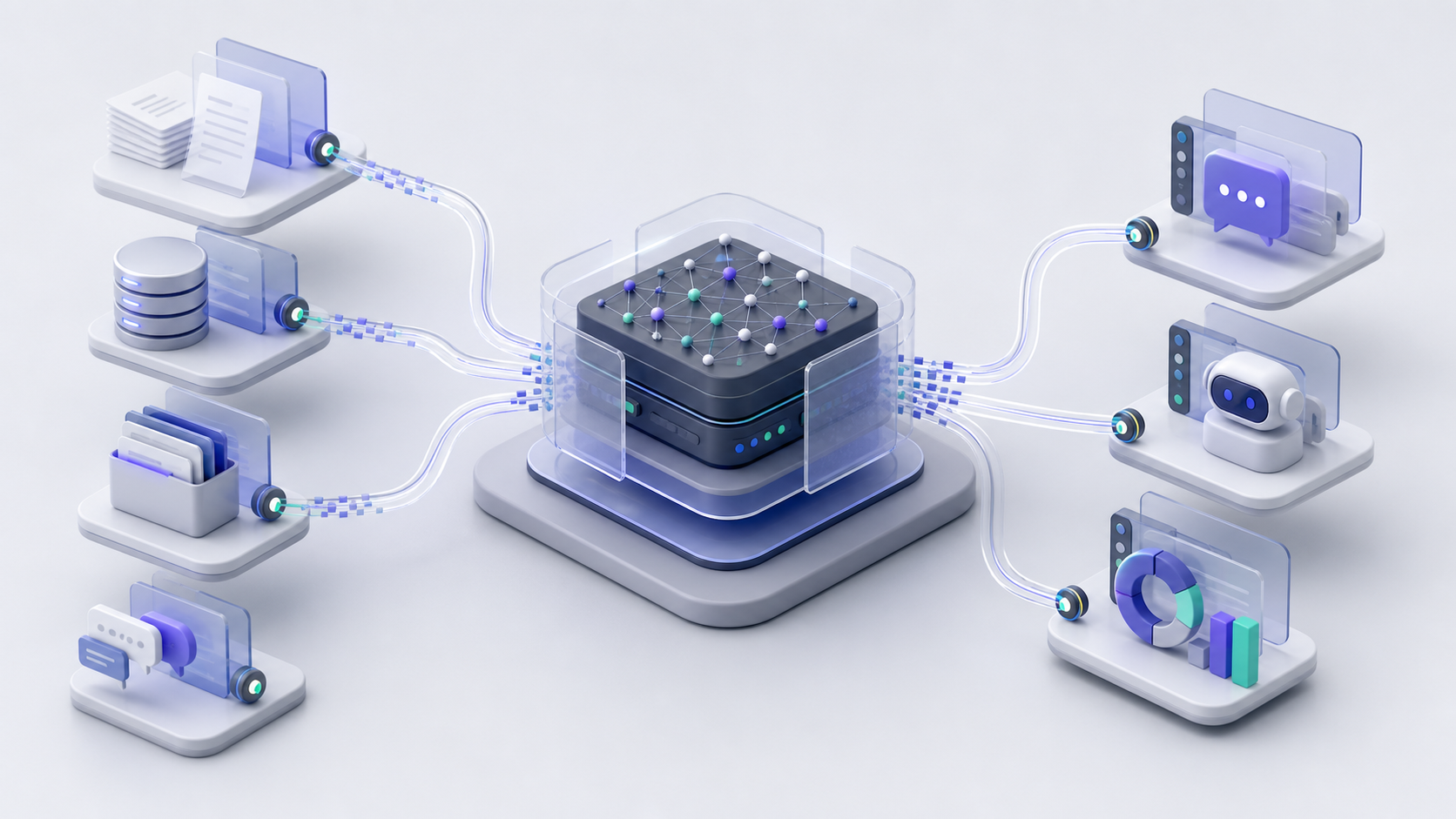
This is where workflow plugins such as Impeccable are useful to study. The interesting part is not that they make a prompt longer. The interesting part is that the workflow tries to give the agent persistent design context, project files, review instructions, and anti-patterns. The Impeccable plugins page frames this as installable support for coding-agent workflows, rather than a one-off prompt trick.
That is the right direction.
Beautiful frontends are easier to generate when taste is explicit.
The Five Layers of a Beautiful AI Frontend
A good AI frontend workflow needs five layers.
1. Product Truth
Before design starts, the agent needs to know what the page is allowed to claim.
This protects the interface from fake polish.
The product truth layer should answer:
- Who is the user?
- What job are they trying to complete?
- What facts are known?
- Which claims need sources?
- Which product capabilities are real?
- Which metrics or examples are allowed?
- What should never be invented?
This matters for SEO and GEO too. Google's guidance on AI-generated content and Search emphasizes helpful, people-first content rather than content made only to manipulate rankings. A beautiful AI-generated page with hallucinated claims is not an asset. It is a liability.
If you want a polished homepage, landing page, dashboard, or app screen, start by giving the agent truth boundaries.
2. Visual Direction
The second layer is the visual brief.
This is not a full design spec. It is a directional constraint.
It should say:
- what the interface should feel like
- what it should not feel like
- how dense it should be
- how much whitespace is appropriate
- whether the user is browsing, deciding, comparing, configuring, or operating
- what kind of imagery belongs on the page
- which visual tropes are banned
For example:
| Product type | Better visual direction |
|---|---|
| SaaS operations tool | Dense, quiet, scan-friendly, low decoration |
| AI research notebook | Structured, technical, citation-heavy, calm |
| Legal workflow tool | Trustworthy, restrained, audit-friendly |
| Consumer creative app | Expressive, tactile, playful |
| Data dashboard | Clear hierarchy, strong chart labeling, low ornament |
Most AI frontends fail because they use the same visual direction for every product.
Everything becomes a dark hero, a glowing abstract object, a row of cards, three feature blocks, and a fake dashboard.
That is not taste.
That is autocomplete.
3. Layout Grammar
Beautiful interfaces have rhythm.
They use repeated spacing, predictable alignment, clear hierarchy, and stable proportions. The AI agent needs these rules before it starts writing components.
Give it constraints like:
- maximum content width
- grid behavior
- heading scale
- section spacing
- card radius
- button sizes
- mobile breakpoints
- line length
- image aspect ratios
- table density
- chart label rules
The Nielsen Norman Group's aesthetic-usability effect is a useful reminder that users often perceive attractive interfaces as easier to use. But that does not mean decoration fixes usability. A beautiful frontend must still make the next action obvious.
Layout grammar is what keeps the page from becoming a pile of attractive fragments.
4. Component States
A screenshot can hide missing states.
A product cannot.
Every real frontend needs states:
- empty
- loading
- error
- success
- disabled
- focused
- hover
- selected
- permission denied
- no results
- long text
- narrow viewport
AI agents often build the default state and stop. That is why the result looks good in the first viewport and falls apart as soon as a real user interacts with it.
Beautiful frontend work includes state design.
The agent should be asked to build and inspect the awkward cases, not only the ideal case.
5. Visual QA
The final layer is verification.
Do not ask the same model that built the UI whether the UI is good.
Use tools.
At minimum, a serious AI frontend workflow should run:
- production build
- lint or type checks
- responsive screenshot checks
- basic accessibility checks
- click-through smoke tests
- long-title and long-content checks
- image loading checks
- route status checks
For accessibility, use the WCAG 2.2 principles as the baseline: perceivable, operable, understandable, and robust. Good visual design cannot compensate for unreadable contrast, missing focus states, or broken keyboard behavior.
Beauty has to survive use.
A Practical Workflow for AI-Built Frontends
Here is the workflow I would use.
It is model-aware, but not model-obsessed.
Step 1: Write the Product Brief
Use a strong reasoning model, or a human, to create a short product brief.
The brief should include:
- audience
- task
- page goal
- source-backed facts
- product claims
- calls to action
- constraints
- forbidden claims
This prevents the design step from inventing the product.
Step 2: Write the Taste Brief
Create a DESIGN.md or equivalent design brief.
Include:
- brand adjectives
- reference sites
- anti-reference sites
- color rules
- typography direction
- density rules
- component expectations
- mobile expectations
- animation limits
Do not say "make it premium."
Say what premium means for this product.
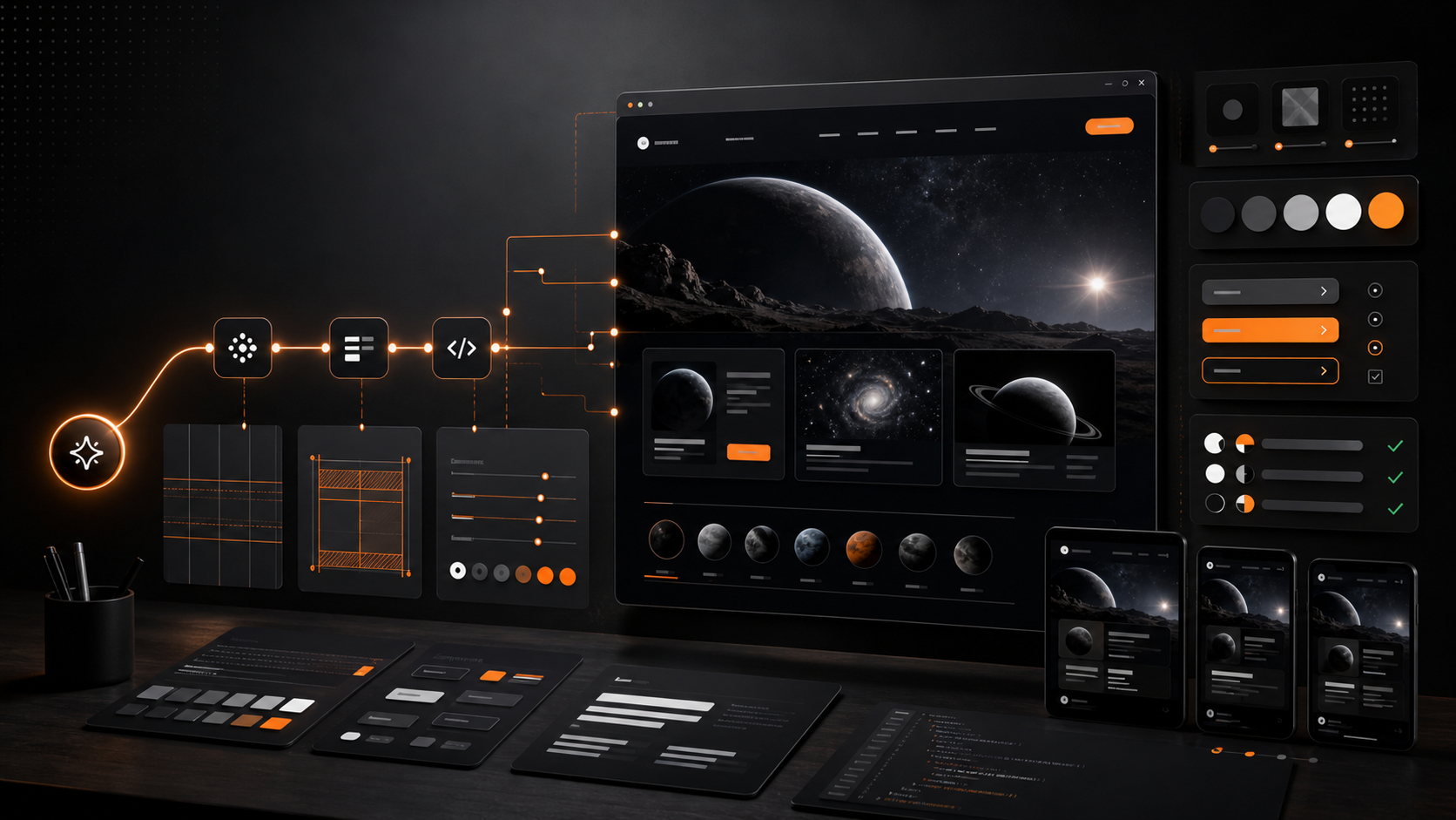
Step 3: Generate Multiple Directions, Not the Final App
This is where a fast, visually capable model can be useful.
Ask for two or three interface directions:
- one conservative
- one expressive
- one operational or dense
The goal is not to ship the first output. The goal is to explore shape, rhythm, and hierarchy quickly.
Pick a direction. Then harden it.
Step 4: Convert the Direction Into Components
Once you choose the direction, ask the implementation agent to turn it into reusable components.
This is where many AI-built frontends get worse. The first page looks good, but every new section improvises.
Make the agent extract:
- buttons
- cards
- tables
- form controls
- nav
- section headers
- metric blocks
- empty states
- modals
- chart containers
Beautiful frontends are consistent because the system is consistent.
Step 5: Add Real States and Real Data Shapes
Do not review only the happy path.
Ask the agent to render:
- no data
- too much data
- failed request
- long customer name
- missing image
- unauthorized user
- mobile viewport
- slow loading
This is where the interface becomes believable.
Step 6: Run Visual QA
Open the app.
Take screenshots.
Check desktop and mobile.
Click the main flows.
Look for:
- overlapping text
- clipped buttons
- low contrast
- fake links
- broken spacing
- inconsistent card heights
- unreadable charts
- sections that look like different products
- decorative UI that does not explain anything
Then feed the defects back as a concrete punch list.
The Prompt Pattern That Works Better
Instead of this:
Build a beautiful SaaS landing page for an AI dashboard product.
Use this:
Build a focused product page for an AI dashboard tool used by operations teams. The page should feel quiet, trustworthy, and decision-oriented, not like a generic startup launch page. Use a compact editorial layout, clear information hierarchy, restrained orange accents, no gradient hero, no fake testimonials, no nested cards, no decorative blobs. Include desktop and mobile responsive behavior, empty/loading/error states for interactive areas, and make every product claim grounded in the provided brief.
That is not just a longer prompt.
It is a better contract.
Where Model Routing Fits
The video-transcript idea that inspired this article has a useful insight: different models are good at different parts of the workflow.
That is true.
But the provider split should be secondary.
Use a visually strong model for early UI exploration. Use a stronger reasoning model for product truth, integrations, and edge cases. Use cheaper models for summarization and repetitive scaffolding. Use deterministic tools for verification.
The routing should follow the work:
| Work | Good route |
|---|---|
| Product claims and source-backed copy | Reasoning model plus source ledger |
| Visual exploration | Visually capable model or design-specialized agent |
| Component extraction | Coding agent with design brief |
| Backend and integrations | Strong reasoning/coding model |
| Accessibility and visual QA | Browser automation plus checks |
| Final copy review | Human or source-grounded review agent |
The mistake is letting the UI model invent the product.
The second mistake is letting the reasoning model over-specify the visuals so tightly that the design model has no room to do good work.
The handoff should say what must be true, not exactly where every card goes.
What This Means for ChartsAI and DashDashGo
This is also why tools like ChartsAI and DashDashGo became vulnerable to coding agents.
If the value is just "generate a chart" or "generate a dashboard," modern coding agents can increasingly do that inside the user's existing workspace.
The durable value is not the generated surface.
The durable value is the taste and truth system around it:
- Does the dashboard metric mean what it says?
- Is the chart type appropriate?
- Is the copy truthful?
- Does the layout help the user decide?
- Are data states handled?
- Can the result be audited?
- Did the agent test what it built?
That is the lesson for AI frontend products too.
The generated UI is becoming cheap.
Good judgment is not.
The Beautiful Frontend Checklist
Before you accept an AI-built frontend, check this:
- The page has a clear user and job.
- The visual style matches the product category.
- The first viewport communicates the real product, not a generic promise.
- The headline is specific.
- The copy does not invent claims.
- The layout has consistent spacing rhythm.
- The design has a restrained color system.
- The typography scale is intentional.
- The page works on mobile.
- Every interactive element has states.
- Long text does not break the layout.
- Images load and have sensible alt text.
- Charts and tables answer a real question.
- Buttons lead somewhere real.
- The final result has been checked in a browser.
If most of those are missing, the frontend is not beautiful.
It is a screenshot.
Primary Sources and Further Reading
- Gemini 3.5 Flash model card for Google's description of coding, agentic tool-use, and UI-control evaluations.
- Claude Opus model page for Anthropic's positioning of Opus on advanced coding and agentic workflows.
- Impeccable and Impeccable plugins for a workflow-plugin approach to AI front-end design.
- Nielsen Norman Group: Aesthetic-usability effect for research-backed context on why visual design affects perceived usability.
- WCAG 2.2 for accessibility requirements that beautiful interfaces still need to satisfy.
- Google Search guidance on AI-generated content for people-first, source-grounded content principles.
The Bottom Line
AI agents can now produce frontends that look surprisingly good.
But if you want beautiful frontends repeatedly, do not rely on taste emerging from a model.
Build a taste system.
Give the agent product truth, visual constraints, anti-patterns, component states, and visual QA.
That is how AI-generated UI starts to feel less like a demo and more like software designed by someone who cared.