What are we trying to achieve?
This article is a product strategy memo for teams building AI analytics. It explains why the standalone AI chart generator is becoming weak, and what still deserves to exist as software.
The Old Promise Was Simple
The original promise of AI dashboard software was obvious:
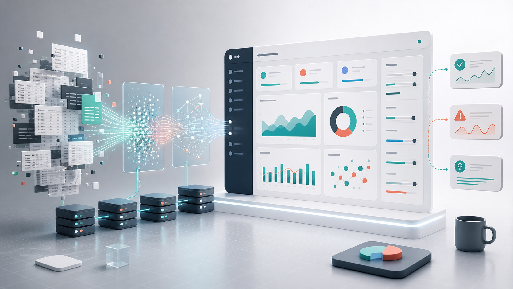
Upload data. Ask a question. Get a dashboard.
No code. No SQL. No learning curve.
That promise still matters. Most teams do not want to spend an afternoon picking chart types, fixing axes, exporting screenshots, and explaining numbers in a weekly meeting. They want to know what changed, why it changed, and what decision to make.
But the product boundary has moved.
Coding agents and general AI assistants can increasingly read files, write code, generate chart components, run queries, and iterate in the same workflow where the user is already working. OpenAI describes Codex as a coding agent for building and shipping software with AI. Anthropic describes Claude Code as an agentic coding system that reads codebases, makes changes, runs tests, and delivers code.
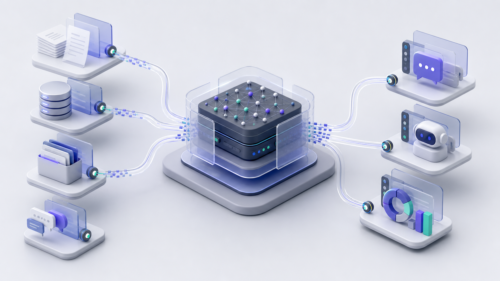
That matters for dashboards because many dashboards are just software artifacts: queries, transformations, charts, layout, copy, and sharing.
If a coding agent can create the chart component or the small dashboard app, the standalone "AI chart generator" becomes less defensible.
The Lesson From ChartsAI and DashDashGo
We learned this directly.
ChartsAI was built around agentic chart generation: connect data, chat with AI, and get production-grade charts and dashboards.
DashDashGo was built around an even clearer promise: your data deserves a dashboard. Upload datasets, connect databases, let AI create visualizations, then share the dashboard with a team.
Those were real needs. They still are real needs.
But products like ChartsAI and DashDashGo got compressed by the same AI capabilities they were built to expose. Codex-style and Claude-style agents made chart generation feel less like a standalone destination and more like a native capability inside a broader workflow.
That does not mean dashboards die.
It means the durable value moved.
The Chart Is Not the Moat
If anyone can generate a dashboard, the hard part is no longer "make a chart."
The hard part is making the chart trustworthy, repeatable, permission-aware, and connected to a decision.
That is a different product.
| Layer | Weak product surface | Durable product surface |
|---|---|---|
| Visualization | Generate a pretty chart | Choose the right view for the analytical question |
| Metrics | Let the model infer definitions | Use governed definitions with owners and caveats |
| Data | Accept any uploaded file | Validate freshness, schema, quality, and access |
| Trust | Show an AI explanation | Show source, query, filters, row count, and assumptions |
| Workflow | Share a dashboard link | Assign the follow-up decision and preserve the review trail |
What Still Matters When Dashboards Are Easy to Generate
1. Metric Definitions
Every dashboard is downstream of a metric definition.
"Revenue" sounds simple until one team means booked revenue, another means recognized revenue, and another excludes refunds. "Active users" sounds simple until a product team counts logins while a growth team counts meaningful sessions.
An AI dashboard generator can produce a clean chart from a messy definition. That is worse than an ugly chart because it creates confidence in the wrong number.
Good AI dashboard systems need a metric layer:
- metric name
- calculation
- grain
- filters
- exclusions
- owner
- source table
- freshness
- caveats
The agent should not invent this. It should read it.
This is why mature analytics tools invest in semantic layers, models, metrics, and permissions. Apache Superset positions itself as a data exploration and visualization platform with a lightweight semantic layer for defining dimensions and metrics. Metabase metrics documentation explains metric formulas, default time dimensions, and permissions for who can create, view, or use metrics.
2. Data Contracts
Dashboards break quietly when the underlying data changes.
A column is renamed. A source starts sending null values. A status enum adds a new value. A timezone assumption changes. The chart still renders, but the answer drifts.
AI makes this failure mode more dangerous because the model can explain a broken chart fluently.
A production dashboard agent needs data contracts:
- required columns
- accepted types
- valid ranges
- update frequency
- source ownership
- freshness expectations
- quality checks
If the data contract fails, the dashboard should show a data issue. It should not let the model narrate a fake trend.
3. Analytical Intent
Most dashboards answer the wrong question because users ask for a chart, not a decision.
"Show sales by region" is a chart request.
"Which region needs intervention this week?" is a decision request.
The second question changes the output. It may need a trend, a benchmark, a denominator, a confidence note, and an owner for the follow-up action.
| User intent | Better dashboard behavior |
|---|---|
| Monitor | Show trend, thresholds, freshness, and alerts |
| Diagnose | Show drivers, segments, deltas, and likely causes |
| Compare | Normalize by denominator and expose cohort differences |
| Forecast | Show assumptions, uncertainty, and sensitivity |
| Decide | Show options, tradeoffs, risks, and recommended next step |
4. Provenance
A useful AI dashboard should make it easy to answer four questions:
- Where did this number come from?
- What query or transformation produced it?
- What filters were applied?
- What assumptions affect interpretation?
This does not mean every user needs to read SQL. It means the system should preserve a trust trail: source, query, filters, refresh time, row count, metric definition, and methodology.
Without that trail, the dashboard becomes an attractive opinion.
5. The Workflow After the Insight
Dashboards rarely matter because one person looked at them. They matter because a team aligns around a decision.
Sharing is not just a public link.
It includes:
- who can view the dashboard
- who can inspect the source
- who can change the metric definition
- who gets notified when a threshold is crossed
- who owns the follow-up action
- what changed after the decision
This is the part most chart tools underbuild. It becomes more important when dashboards are generated on demand.
Is RAG Part of Data Visualization?
Not directly.
RAG is a retrieval-and-generation pattern for grounding language outputs in external context. It is not a visualization technique, a BI layer, or a charting method.
RAG can help an analytics assistant when the assistant needs to retrieve metric definitions, release notes, incidents, glossary entries, or methodology docs before explaining a chart. But the chart itself is still produced by querying, aggregating, and visualizing data.
So the technically correct statement is:
AI dashboards do not need RAG to draw charts. They may use retrieval when explaining charts requires external business context.
Open Source Building Blocks Still Matter
Open-source analytics tools are not going away. They become better building blocks for agent workflows.
- Apache Superset is useful for BI dashboards, exploration, and semantic metrics.
- Metabase is useful for internal analytics, dashboards, models, metrics, and permissions.
- Evidence is useful when reports, decision-support tools, and embedded dashboards should live as SQL and Markdown in version-controlled code.
- DuckDB is useful for local analytical workflows because it can query files and cloud data directly with SQL.
The important abstraction is not which tool wins.
It is whether your AI workflow can preserve definitions, provenance, permissions, and review.
The Dashboard Agent Spec
If we were designing an AI dashboard product today, we would not start with "generate charts from data."
We would start with this spec:
A useful dashboard agent should:
- Clarify the business question before choosing the chart.
- Identify the metric definition and source of truth.
- Validate schema, freshness, and permissions.
- Generate the query and visualization.
- Expose source, query, filters, row count, and caveats.
- Let a technical user inspect and revise the query.
- Let a non-technical user ask follow-up questions.
- Turn the result into an action, review, alert, or shared report.
- Make the dashboard reproducible later.
Primary Sources and Further Reading
- OpenAI Codex and Claude Code for the coding-agent capability shift.
- Apache Superset docs for BI, data exploration, visualization, and semantic metrics.
- Metabase metrics docs for metric definitions and permissions.
- Evidence docs for SQL and Markdown based data products.
- DuckDB for embedded and file-oriented analytical SQL workflows.
The Bottom Line
AI dashboards are not disappearing. They are becoming native to broader AI workflows.
That raises the bar.
A dashboard should not just visualize data. It should preserve trust, clarify the decision, and help the team act.
The future of AI dashboard software is less about chart magic and more about data products that can explain themselves.